Design and Submission Guideline
General Guide
Colour
-
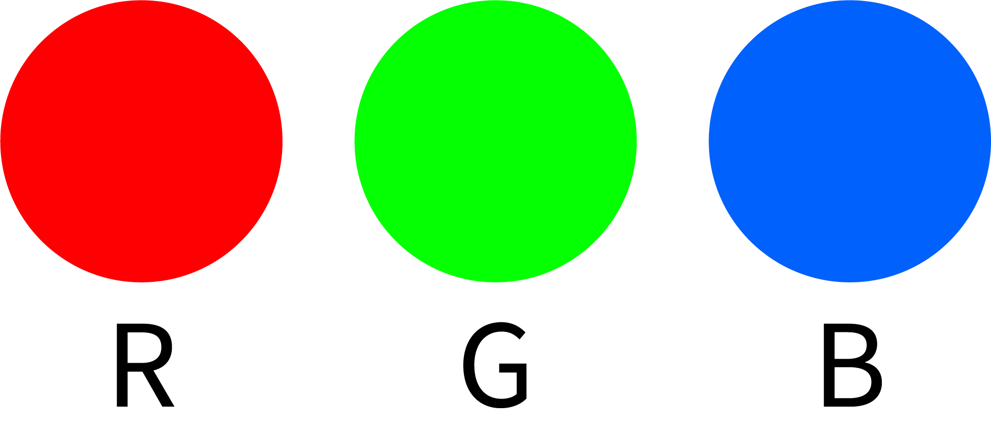
Use ONLY CMYK colour mode in your artwork.


The use of other colour modes such as RGB and Pantone will cause inaccurate output of colours.


-
AVOID setting colour tints (toning) lower than 10%.
Lighter shades usually print much lighter than they appear on screen and you may be disappointed with the result.
 C=20 M=5 Y=5 K=0

 C=5 M=5 Y=5 K=0

 C=10 M=5 Y=8 K=0

-
DO NOT set black to (C=100 M=100 Y=100 K=100).
 C=100 M=100 Y=100 K=100

Too much ink coverage may result in sheets sticking together and cause text or image to appear blurred.
To get the most from black, use either (C=40 M=30 Y=30 K=100) or (C=0 M=0 Y=0 K=100).
 C=40 M=30 Y=30 K=100

 C=0 M=0 Y=0 K=100

*However, avoid using SUPER BLACK (C=40 M=30 Y=30 K=100) on small text due to ink spread.
C: 0%, M: 0%, Y: 0%, K:100%
Lorem ipsum

Lorem ipsum

C: 40%, M: 30%, Y: 30%, K:100%
Lorem ipsum Lorem ipsum
-
For offset and large images, maximum total ink coverage must not be more than 240% (C+M+Y+K<240%).
Too much ink coverage may cause set off problems (sheets sticking together, causing text or images to appear blurred).
 C=10 M=20 Y=100 K=0

 C=50 M=60 Y=100 K=40

-
To make tint/toning effects more visible, make sure the value between colours has at least a 10% difference, with a recommendation of 20% and above.
 Background: C=0 M=100 Y=85 K=45Background: C=0 M=100 Y=85 K=35Tint difference: 10
 Background: C=0 M=100 Y=85 K=45Background: C=0 M=100 Y=85 K=25Tint difference: 20
 Background: C=0 M=100 Y=85 K=45Background: C=0 M=100 Y=85 K=50Tint difference: 5
Line
-
DO NOT set line weight less than 0.25pts
(Not applicable for Spot UV & Hot-Stamping - refer to Spot UV & Hot-Stamping section for details.)
 0.10pt

 0.20pt

 0.25pt

 0.50pt

 1.00pt

Image
-
Ensure all images are in CMYK colour mode.
-
For digital press and offset printing, make sure that the resolution of all your images is set to 300 dpi or above.
E.g.

Scanned line art/black & white images resolution should be set to 1200 dpi or above.
E.g.
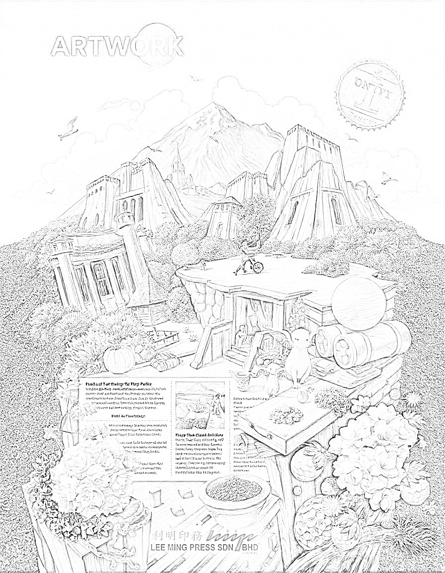
For large image printing, ensure that the resolution of all your images is set to 150 dpi or above.
E.g.

*Unless your artwork is very large and does not need near view, you can flexibly adjust to a lower resolution.
-
DO NOT manipulate your images using a layout program.
You are advised to manipulate your images using Adobe Photoshop. Resolution and size (dimension) are inversely proportional to each other, which means when you are enlarging the image in a layout program, you are actually reducing the resolution.
Results of manipulating images in layout program
Resampling (72dpi to 300dpi)


Enlargement (300dpi to 150dpi)


Text
-
Generally, the minimum font size is 4pts.
For hot stamping, use bold sans serif font with the minimum size of 10pts and with line thickness of more than 0.5pt.
During the printing process, minute misalignment can cause the 4 separate CMYK inks to overlap imperfectly in small text and cause the text to look blurry.
-
While working on small fonts, avoid:
- White text on a coloured or black background
Lorem ipsum Lorem ipsum
- Light coloured text on a white background
Lorem ipsum
- Font types that have thin lines
- Reverse printing (white text on coloured background made up of a combination of 2 or more CMYK colour values).
Lorem ipsum
- All wording with a font size less than or equal to 5pts without bold must be added with an outline to reduce blurry text appearance.
Lorem ipsum
- While working on a white background with black text and lines, use K=100 only.
- White text on a coloured or black background
-
Layout Program: Curve/Create Outline/Path all the fonts before converting the artwork file to PDF file format.Adobe Photoshop: Set resolution to 300 dpi or above and rasterize type before saving the artwork file to PDF file format.
Please avoid setting text using Photoshop as the text will not be as clear as setting text in a layout program.
Artwork File Preparation Guide
Bleed
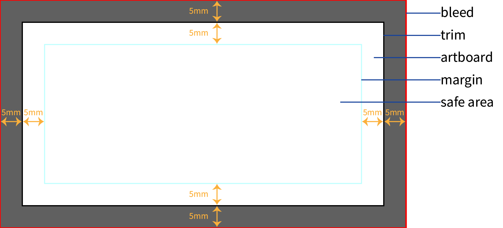
Definition: Bleed refers to the area of your artwork that extends beyond the trim line. This ensures that your design covers the entire page after trimming.
Why It Matters: During the printing process, the paper can shift slightly, and bleed compensates for this movement. Without bleed, you might end up with thin white lines on the edges of your printed piece where the design was meant to extend to the edge.
How to Implement:
- Set Up: Add
5mm of bleed to each edge of your artwork beyond the trim line.
- Design: Extend background colors, images, or design elements into the bleed area.
- Software Tools: Most design software allows you to set up bleed guidelines to help ensure your design elements extend far enough.
For artwork with background that stretches till the edge of the page, please create bleed (5mm for every side) for every page.
However, you do not need to create bleed for pages with white background and which the contents are centered in the page.
Definition: Bleed refers to the area of your artwork that extends beyond the trim line. This ensures that your design covers the entire page after trimming.
Why It Matters: During the printing process, the paper can shift slightly, and bleed compensates for this movement. Without bleed, you might end up with thin white lines on the edges of your printed piece where the design was meant to extend to the edge.
How to Implement:
- Set Up: Add
5mmof bleed to each edge of your artwork beyond the trim line. - Design: Extend background colors, images, or design elements into the bleed area.
- Software Tools: Most design software allows you to set up bleed guidelines to help ensure your design elements extend far enough.
However, you do not need to create bleed for pages with white background and which the contents are centered in the page.
Trim
Definition: Trim refers to the final size of your printed piece after it has been cut from the larger sheet of paper.
Why It Matters: Understanding the trim size ensures that your design is created to fit the exact dimensions of the finished product, without losing important content or having uneven edges.
How to Implement:
- Specify Dimensions: Set the document size in your design software to match the final trim size of your product.
- Design to Size: Ensure all critical elements of your design are within the trim area and not extending into the bleed.
Make sure your artwork document size for every page is according to the output paper size.
Definition: Trim refers to the final size of your printed piece after it has been cut from the larger sheet of paper.
Why It Matters: Understanding the trim size ensures that your design is created to fit the exact dimensions of the finished product, without losing important content or having uneven edges.
How to Implement:
- Specify Dimensions: Set the document size in your design software to match the final trim size of your product.
- Design to Size: Ensure all critical elements of your design are within the trim area and not extending into the bleed.
Margin
Definition: Margin is the space between the trim edge and the content of your design. It’s essentially a buffer zone that ensures that important text and graphics are not too close to the edges.
Why It Matters: Margins help prevent important elements from being cut off or too close to the edge, especially when the paper shifts slightly during the trimming process.
How to Implement:
- Set Margins: Typically, a margin of at least
5mm from the trim edge is recommended for text and critical elements.
- Check Design: Make sure all important content is within this margin to avoid accidental cutting or poor appearance.
Definition: Margin is the space between the trim edge and the content of your design. It’s essentially a buffer zone that ensures that important text and graphics are not too close to the edges.
Why It Matters: Margins help prevent important elements from being cut off or too close to the edge, especially when the paper shifts slightly during the trimming process.
How to Implement:
- Set Margins: Typically, a margin of at least
5mmfrom the trim edge is recommended for text and critical elements. - Check Design: Make sure all important content is within this margin to avoid accidental cutting or poor appearance.
Safe Area
Definition: The safe area, also known as the "live area," is the zone within the trim size where you should keep all critical content like text, logos, and important images. This area ensures that essential elements are not cut off during trimming.
Why It Matters: Keeping content within the safe area helps avoid problems where parts of your design might be trimmed off or appear too close to the edge.
How to Implement:
- Define Safe Area: Typically, the safe area should be at least
5mm inside the trim size, but this can vary based on the specific project and printer recommendations.
- Position Content: Place all critical design elements within this zone to ensure they are not affected by the trimming process.
Definition: The safe area, also known as the "live area," is the zone within the trim size where you should keep all critical content like text, logos, and important images. This area ensures that essential elements are not cut off during trimming.
Why It Matters: Keeping content within the safe area helps avoid problems where parts of your design might be trimmed off or appear too close to the edge.
How to Implement:
- Define Safe Area: Typically, the safe area should be at least
5mminside the trim size, but this can vary based on the specific project and printer recommendations. - Position Content: Place all critical design elements within this zone to ensure they are not affected by the trimming process.
When preparing artwork for printing, understanding and correctly applying bleed, trim, margin, and safe area is essential for producing a high-quality print.
Bleed ensures your design extends to the edge of the paper.
Trim defines the final size of the product.
Margin prevents content from being too close to the edge.
Safe area keeps crucial content from being cut off.
Properly setting these parameters helps ensure your printed materials look professional and meet your expectations.
By incorporating these practices into your design process, you ensure a more polished and precise final product, enhancing the overall quality of your printed materials.
Example Layouts
-
Flyer: Final Size: 127 mm x 178 mm, Document Size (with Bleed): 137 mm x 188 mm, Safe Zone:
5 mmfrom edge. -
Business Card: Final Size: 89 mm x 51 mm, Document Size (with Bleed): 99 mm x 61 mm, Safe Zone:
5 mmfrom edge. -
Booklet: Final Size: 210 mm x 279 mm, Document Size (with Bleed): 220 mm x 289 mm, Safe Zone:
5 mmfrom edge.
File Types and Exporting: PDF is preferred. TIFF, EPS, and high-resolution JPEGs are also acceptable. Ensure proper export settings with bleed included and resolution at 300 DPI.
Important Considerations: Always proof your design to check for errors and ensure all elements are correctly positioned.
Artwork Orientation Guide
Ensure your artwork is correctly oriented for the final print product by following these guidelines:
-
Document Orientation: Set your document’s orientation to match the final print product. For example, use portrait orientation for vertical designs and landscape orientation for horizontal designs. Make sure the artwork aligns with the intended print direction.
-
Bleed Area Alignment: Ensure that the bleed area is properly aligned with the document’s edges. For landscape orientations, check that the bleed extends correctly along the width and height of the document. For portrait orientations, make sure the bleed area is consistent on all sides.
-
Image Placement: Verify that images and important elements are correctly positioned within the document’s orientation. For landscape designs, ensure that horizontal images are correctly aligned. For portrait designs, check that vertical images fit appropriately.
-
Text Alignment: Align text according to the orientation of the document. For landscape layouts, text should be arranged horizontally. For portrait layouts, text should be oriented vertically. Make sure text is readable and not too close to the edges.
Landscape Orientation
Portrait Orientation
Mixed Orientation
Example Orientations
-
Flyer (Portrait): Final Size: 127 mm x 178 mm, Orientation: Vertical. Ensure all design elements are correctly aligned with vertical orientation.
-
Business Card (Landscape): Final Size: 89 mm x 51 mm, Orientation: Horizontal. Ensure that all text and images are aligned horizontally.
-
Booklet (Portrait): Final Size: 215.9 mm x 279.4 mm, Orientation: Vertical. Verify that pages are laid out correctly for vertical binding.
File Types and Exporting: PDF is recommended for maintaining orientation integrity. Ensure the document is set to the correct orientation before exporting. Other acceptable formats include TIFF and high-resolution JPEGs.
Important Considerations: Double-check the orientation of each page or panel, especially for multi-page documents and booklets. Review your design to confirm that it aligns with the intended print layout.
Running Number Job Guide
Follow these guidelines to prepare artwork for jobs requiring running numbers or variable data:
-
File Preparation: Create a master file with static content and provide a separate file with running number data or variable elements. Ensure all variable data fields are clearly marked.
-
Numbering Sequence: Define and provide the numbering sequence in your data file. Ensure that the sequence is correctly formatted and matches the order of the printed items.
-
Positioning: Indicate where the running numbers should appear on the artwork. Use clear markers or annotations to show the placement.
-
Proofing: Review a proof to verify that the running numbers are correctly placed and the sequence is accurate before finalizing the print job.
Example Running Number Jobs
-
Event Tickets: Numbering on the bottom of each ticket. Ensure each ticket has a unique number and is in the correct sequence.
-
Invoices: Running numbers in the top right corner. Confirm the sequence and positioning before printing.
Prepare ONLY 2 Files
Template
File 1: Artwork file

File 2: Numbering file

Example
File 1: Artwork file
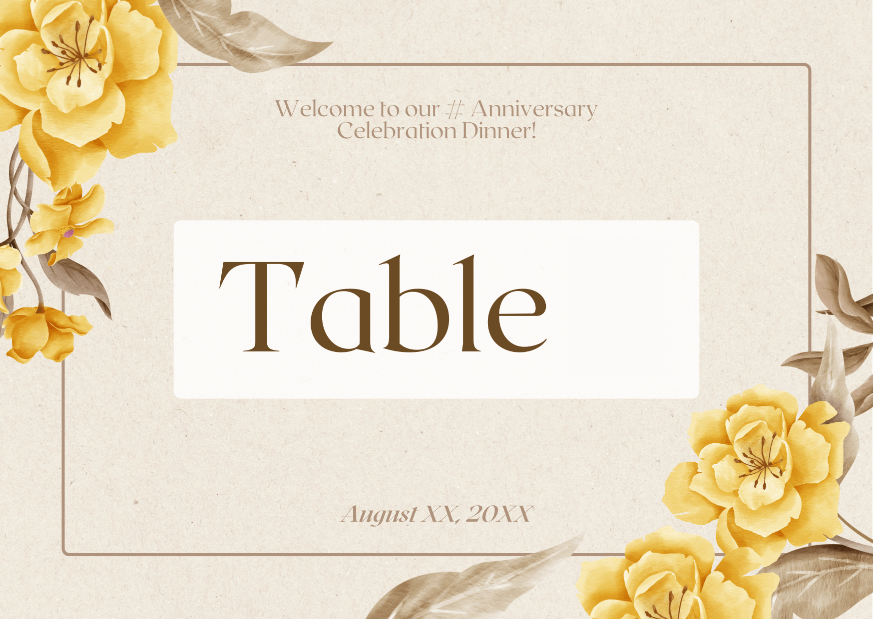
File 2: Numbering file
File Types and Exporting: Use PDF or Excel files for variable data. Ensure files are correctly formatted and that variable fields are clearly defined.
Important Considerations: Double-check the data file for accuracy and ensure all variables are correctly placed in the master file.
Booklet Artwork Guide
Prepare your booklet artwork with these guidelines to ensure correct layout and printing:
-
Document Setup: Set up your artwork in spreads, not individual pages. Include front and back covers, and ensure pages are arranged in the correct order for binding.
-
Bleed and Margins: Include a bleed area of 5mm around all edges of each page. Ensure all critical content is within a margin of 0.25” (1/4 inch) from the edge to avoid cropping.
-
Page Numbering: Clearly indicate page numbers in your artwork, if applicable. Ensure they are positioned correctly and do not interfere with important content.
-
Proofing: Review a proof to check page alignment, color consistency, and bleed areas. Confirm that the booklet is correctly assembled in the proof.
Example Booklets
-
Product Catalog: Includes a front cover, interior pages, and back cover. Ensure the design flows seamlessly across spreads.
-
Annual Report: Set up in spreads with front and back covers. Verify page numbering and content layout before printing.
File Types and Exporting: Use PDF for complete booklet files, including all spreads. Ensure all pages are included and properly ordered.
Important Considerations: Confirm that all pages are correctly aligned and that no critical content is near the binding edge.
Sticker Preparation Guide
Prepare your sticker artwork by following these guidelines to ensure optimal print quality and correct cutting:
-
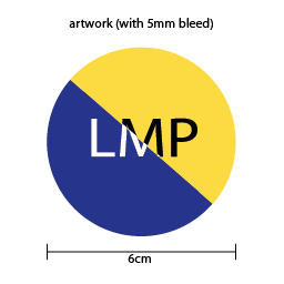
Document Size: Set the document size to the final sticker dimensions. Include a bleed area of 5mm around the sticker to avoid white edges after cutting.
-
Cut Line: Define the cut line clearly, typically using a separate layer or color to indicate where the sticker will be cut. Ensure the cut line does not overlap important design elements.
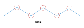
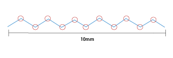
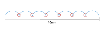
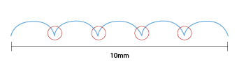
Multi-Edges Die Line: There should not be more than 5 cutting edges within 10mm.




-
Safe Zone: Keep all important text and images at least 5mm away from the cut line to prevent them from being trimmed off.
-
Proofing: Review a proof to check the cut lines, bleed areas, and overall design placement before final printing.
Preparation for sticker file
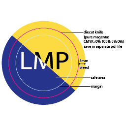
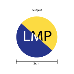
Actual sticker preview
File 1: Sticker artwork (bleed)
File 2: Sticker knife
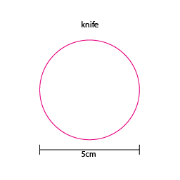
Example Stickers
-
Product Labels: Set up with correct cut lines and bleed areas. Ensure that all text and logos are within the safe zone.
-
Promotional Stickers: Include a bleed area and clearly defined cut line. Check that the design is correctly aligned and not too close to the cut line.
File Types and Exporting: Use PDF or vector formats (e.g., AI, EPS) to ensure precise cut lines and high-quality print output.
Important Considerations: Verify that the cut line and bleed areas are correctly set up, and that no important elements are too close to the edge.
Packaging Box Artwork Guide
Follow these guidelines to prepare artwork for packaging boxes, ensuring correct layout and fold lines:
-
Document Setup: Create artwork using the die-cut template provided. Ensure that all design elements fit within the specified panels and adhere to fold lines.
-
Bleed and Margins: Include a bleed area of 5mm beyond the cut lines to avoid white edges. Maintain a safe zone of 5mm from fold lines and cut edges to ensure critical content is not cut off.
-
Fold and Glue Areas: Pay special attention to areas that will be folded or glued. Avoid placing critical content in these zones to prevent it from being obscured or cut off.
-
Proofing: Review a proof to ensure that all panels align correctly, the bleed areas are properly set, and that the design looks correct when folded into the final box shape.
Example Packaging Boxes
-
Retail Box: Set up with the die-cut template, ensuring all design elements fit correctly on the various panels.
-
Shipping Box: Design must account for fold lines and glue areas. Verify that the artwork aligns properly when folded into the final box shape.
File Types and Exporting: Use PDF with die-cut lines included. Ensure all panels are correctly aligned and the design is accurate for the final box shape.
Important Considerations: Confirm that no critical content is near fold or glue areas, and that the artwork aligns properly with the die-cut template.
3D Finishing Guide
3D Spot UV Finishing Guide
3D Spot UV finishing adds a distinctive, eye-catching element to your print materials by applying a high-gloss, raised coating to specific areas. This technique enhances textures and details, creating a sophisticated contrast against matte or uncoated parts of your design.
Design Considerations
-
Select Areas for Spot UV: Choose the elements of your design that you want to highlight, such as logos, text, or images. Spot UV is most effective on details that benefit from added texture and gloss.
-
Contrast and Visibility: Ensure there is enough contrast between the Spot UV and the rest of the design. High-contrast areas will make the Spot UV effect more pronounced and impactful.
-
File Preparation:
- Create a Spot UV Layer: In your design file, create a separate layer or file for the Spot UV areas. Use a distinct color (e.g., 100% K) to indicate these areas.
- Specify Thickness: Indicate the desired thickness or texture for the Spot UV coating to achieve the intended 3D effect.
-
Avoid Overlapping: Ensure the Spot UV areas do not overlap with critical text or fine details that might be distorted by the coating process.
3D Spot UV Finishing
File 1: Artwork file
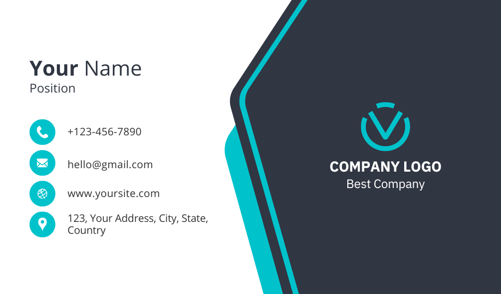
File 2: 3D SPOT UV Element

File 1: Artwork file

File 2: 3D SPOT UV Element

3D Foiling Finishing
File 1: Artwork file

File 2: 3D Foiling Element

File 1: Artwork file

File 2: 3D Foiling Element

3D Spot UV + Foiling Finishing
File 1: Artwork file

File 2: 3D SPOT UV Element

File 2: 3D Foiling Element

File 1: Artwork file

File 2: 3D SPOT UV Element

File 2: 3D Foiling Element

3D Gold + Silver Foiling Finishing
File 1: Artwork file

File 2: 3D SPOT UV Element

File 2: 3D Foiling Element

File 1: Artwork file

File 2: 3D SPOT UV Element

File 2: 3D Foiling Element

File Requirements
-
Format: Submit files in high-resolution PDF, AI, or PSD formats.
-
Resolution: Ensure a minimum resolution of 300 DPI for all design elements to maintain quality.
-
Color Mode: Use CMYK color mode for the primary design and a separate Spot UV layer in a designated spot color (between 35% to 100% K (black)).
Production Tips
-
Proofing: Request a proof to review the Spot UV effect and ensure it meets your expectations before final production.
-
Layered Files: Send layered files to clearly separate the Spot UV design from the main artwork. This helps in accurate placement and application.
-
Review with Printer: Discuss your Spot UV design with our team to confirm compatibility with your chosen print materials and to finalize the finishing details.
3D Spot UV finishing adds a striking visual and tactile dimension to your print projects. By following these guidelines, you can ensure that your design achieves the desired effect and stands out with a unique, professional touch.
Contact Us: For further assistance or to start your project, reach out to our team at Lee Ming Press. We’re here to help you make the most of our 3D Spot UV finishing services!
Templates for Download
To streamline your artwork preparation and ensure adherence to our guidelines for optimal printing results, download the templates provided below.
Feel free to adjust further based on your specific needs or preferences!
Apparel
Sublimation Muslimah T-shirt
Sublimation T-shirt
Business Essentials
Business Name Card
Certificate
Envelopes
Custom Made
Ready Made
Invitation Card
NCR Bill Book
Paper Folder
PP Folder (L Shape Folder)
Synthetic Card
Ticket and Voucher
Flyers and Leaflets
Labels and Stickers
Car Window Stickers
Die Cut Stickers
Capsule Shape (RR)
Flower Shape (PF)
General Shape (IM)
Heart Shape (HI)
Label Shape (LA)
Leaf Shape (LE)
Medal Shape (BT)
Mice Shape (MICE)
Oval Shape (RE)
Phone Shape (PH)
Rectangular + Round Corner Shape (RA)
Star Burst Shape (SF)
Star Shape (SS)
Packaging
Box Waist Seal Band
Cup Sleeve
Cards
Playing Cards
Learning Cards
PokerCards
Premium Gifts
Canvas Bag
Non Woven Bag
Promotional Products
Desk Calendar
Door Hanger
Face Mask Holder
Face Mask Keeper
Flag
Hand Fan
Horse Racing Calendar
Key Card Holder
Money Packets
Mouse Pad
Mug
Paper Bag
Scratch Off Sticker
Tags