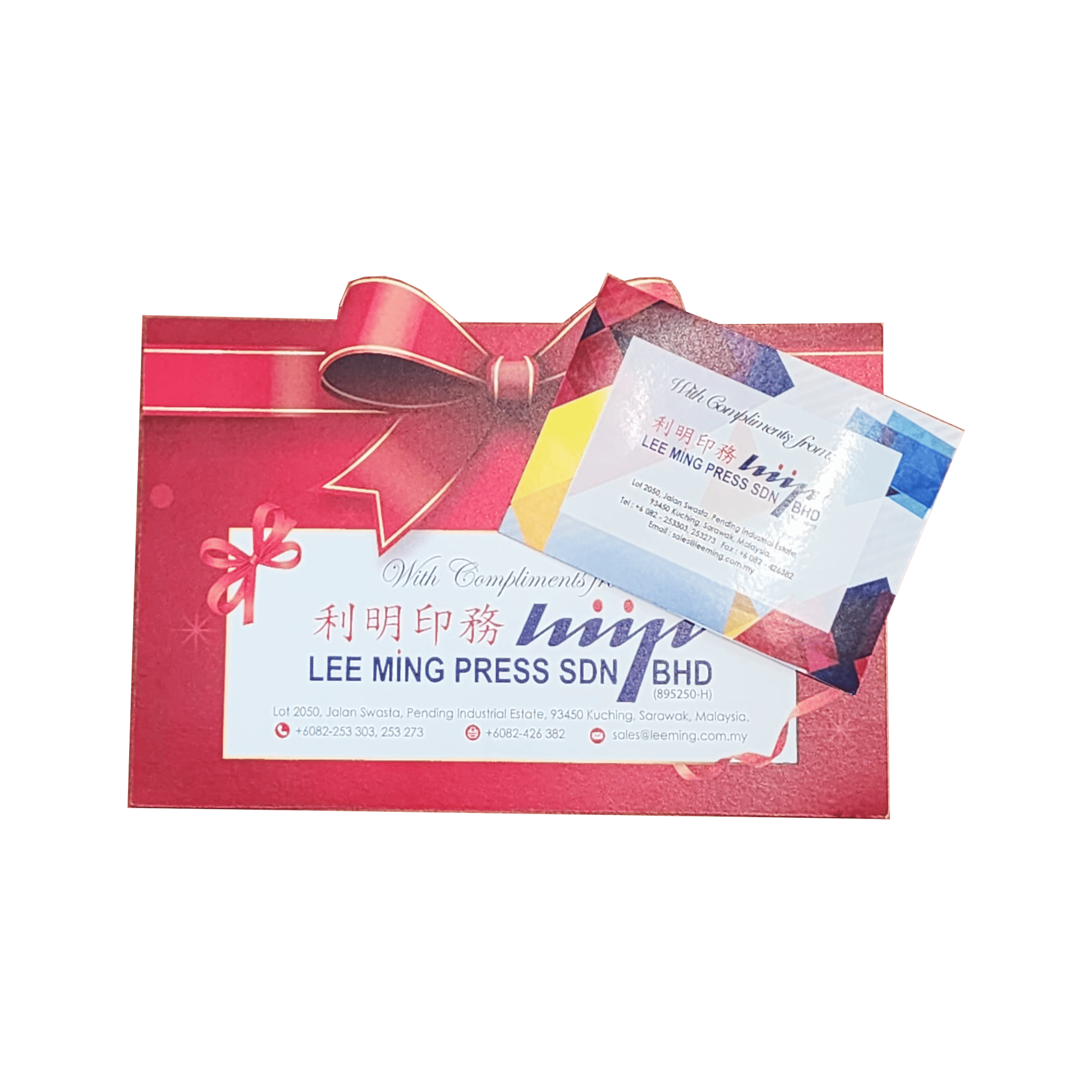
Celebrate achievements and milestones with our custom congratulatory cards. Featuring elegant designs and high-quality printing, our cards are perfect for sending warm wishes and recognition.
Key Features
Customizable Design
Tailor with congratulatory messages and designs.
High-Quality Printing
Vibrant colors and clear text for a polished look.
Durable Paper
Premium cardstock for a lasting impression.
Variety of Sizes
Available in different dimensions to fit your needs.
Eco-Friendly Options
Sustainable paper choices available.
Contact us to get your job done
General Guide
Colour
-
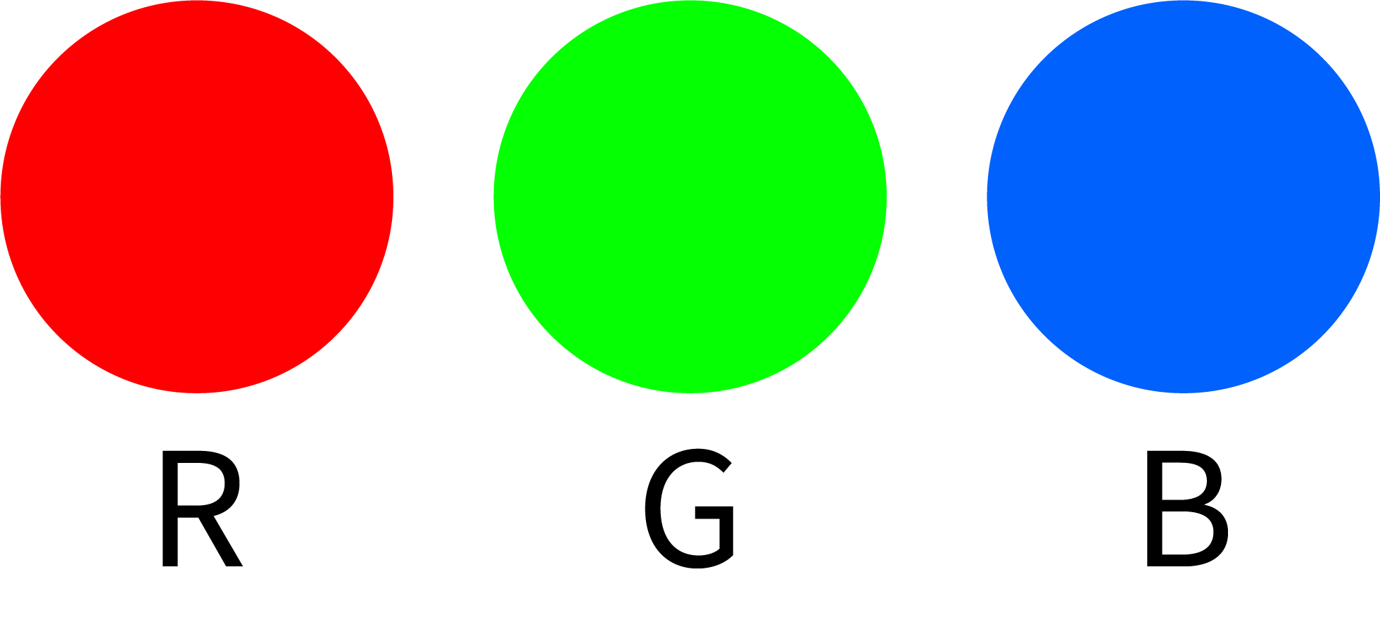
Use ONLY CMYK colour mode in your artwork.


The use of other colour modes such as RGB and Pantone will cause inaccurate output of colours.


-
AVOID setting colour tints (toning) lower than 10%.
Lighter shades usually print much lighter than they appear on screen and you may be disappointed with the result.
 C=20 M=5 Y=5 K=0

 C=5 M=5 Y=5 K=0

 C=10 M=5 Y=8 K=0

-
DO NOT set black to (C=100 M=100 Y=100 K=100).
 C=100 M=100 Y=100 K=100

Too much ink coverage may result in sheets sticking together and cause text or image to appear blurred.
To get the most from black, use either (C=40 M=30 Y=30 K=100) or (C=0 M=0 Y=0 K=100).
 C=40 M=30 Y=30 K=100

 C=0 M=0 Y=0 K=100

*However, avoid using SUPER BLACK (C=40 M=30 Y=30 K=100) on small text due to ink spread.
C: 0%, M: 0%, Y: 0%, K:100%
Lorem ipsum

Lorem ipsum

C: 40%, M: 30%, Y: 30%, K:100%
Lorem ipsum Lorem ipsum
-
For offset and large images, maximum total ink coverage must not be more than 240% (C+M+Y+K<240%).
Too much ink coverage may cause set off problems (sheets sticking together, causing text or images to appear blurred).
 C=10 M=20 Y=100 K=0

 C=50 M=60 Y=100 K=40

-
To make tint/toning effects more visible, make sure the value between colours has at least a 10% difference, with a recommendation of 20% and above.
 Background: C=0 M=100 Y=85 K=45Background: C=0 M=100 Y=85 K=35Tint difference: 10
 Background: C=0 M=100 Y=85 K=45Background: C=0 M=100 Y=85 K=25Tint difference: 20
 Background: C=0 M=100 Y=85 K=45Background: C=0 M=100 Y=85 K=50Tint difference: 5
Line
-
DO NOT set line weight less than 0.25pts
(Not applicable for Spot UV & Hot-Stamping - refer to Spot UV & Hot-Stamping section for details.)
 0.10pt

 0.20pt

 0.25pt

 0.50pt

 1.00pt

Image
-
Ensure all images are in CMYK colour mode.
-
For digital press and offset printing, make sure that the resolution of all your images is set to 300 dpi or above.
E.g.
Scanned line art/black & white images resolution should be set to 1200 dpi or above.
E.g.
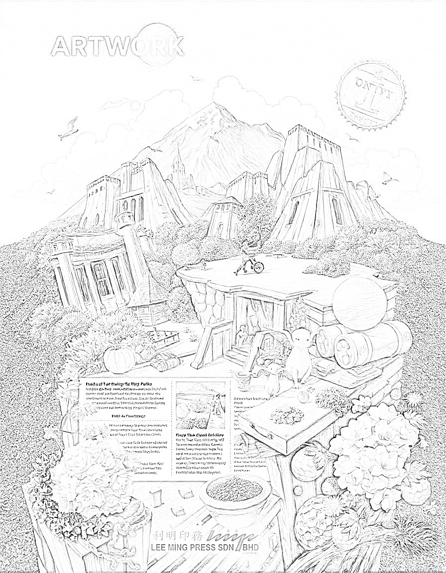
For large image printing, ensure that the resolution of all your images is set to 150 dpi or above.
E.g.

*Unless your artwork is very large and does not need near view, you can flexibly adjust to a lower resolution.
-
DO NOT manipulate your images using a layout program.
You are advised to manipulate your images using Adobe Photoshop. Resolution and size (dimension) are inversely proportional to each other, which means when you are enlarging the image in a layout program, you are actually reducing the resolution.
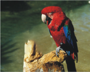
Results of manipulating images in layout program
Resampling (72dpi to 300dpi)


Enlargement (300dpi to 150dpi)

Text
-
Generally, the minimum font size is 4pts.
For hot stamping, use bold sans serif font with the minimum size of 10pts and with line thickness of more than 0.5pt.
During the printing process, minute misalignment can cause the 4 separate CMYK inks to overlap imperfectly in small text and cause the text to look blurry.
-
While working on small fonts, avoid:
- White text on a coloured or black background
Lorem ipsum Lorem ipsum
- Light coloured text on a white background
Lorem ipsum
- Font types that have thin lines
- Reverse printing (white text on coloured background made up of a combination of 2 or more CMYK colour values).
Lorem ipsum
- All wording with a font size less than or equal to 5pts without bold must be added with an outline to reduce blurry text appearance.
Lorem ipsum
- While working on a white background with black text and lines, use K=100 only.
- White text on a coloured or black background
-
Layout Program: Curve/Create Outline/Path all the fonts before converting the artwork file to PDF file format.Adobe Photoshop: Set resolution to 300 dpi or above and rasterize type before saving the artwork file to PDF file format.
Please avoid setting text using Photoshop as the text will not be as clear as setting text in a layout program.
Artwork File Preparation Guide
Bleed
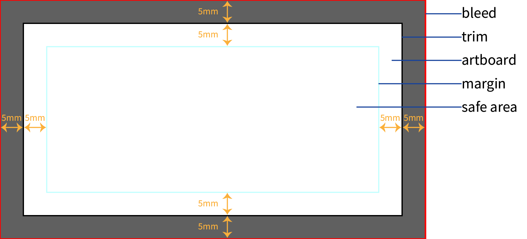
Definition: Bleed refers to the area of your artwork that extends beyond the trim line. This ensures that your design covers the entire page after trimming.
Why It Matters: During the printing process, the paper can shift slightly, and bleed compensates for this movement. Without bleed, you might end up with thin white lines on the edges of your printed piece where the design was meant to extend to the edge.
How to Implement:
- Set Up: Add
1/5 inch (5mm)of bleed to each edge of your artwork beyond the trim line. - Design: Extend background colors, images, or design elements into the bleed area.
- Software Tools: Most design software allows you to set up bleed guidelines to help ensure your design elements extend far enough.
However, you do not need to create bleed for pages with white background and which the contents are centered in the page.
Trim
Definition: Trim refers to the final size of your printed piece after it has been cut from the larger sheet of paper.
Why It Matters: Understanding the trim size ensures that your design is created to fit the exact dimensions of the finished product, without losing important content or having uneven edges.
How to Implement:
- Specify Dimensions: Set the document size in your design software to match the final trim size of your product.
- Design to Size: Ensure all critical elements of your design are within the trim area and not extending into the bleed.
Margin
Definition: Margin is the space between the trim edge and the content of your design. It’s essentially a buffer zone that ensures that important text and graphics are not too close to the edges.
Why It Matters: Margins help prevent important elements from being cut off or too close to the edge, especially when the paper shifts slightly during the trimming process.
How to Implement:
- Set Margins: Typically, a margin of at least
1/4 inch (6mm)from the trim edge is recommended for text and critical elements. - Check Design: Make sure all important content is within this margin to avoid accidental cutting or poor appearance.
Safe Area
Definition: The safe area, also known as the "live area," is the zone within the trim size where you should keep all critical content like text, logos, and important images. This area ensures that essential elements are not cut off during trimming.
Why It Matters: Keeping content within the safe area helps avoid problems where parts of your design might be trimmed off or appear too close to the edge.
How to Implement:
- Define Safe Area: Typically, the safe area should be at least
1/4 inch (6mm)inside the trim size, but this can vary based on the specific project and printer recommendations. - Position Content: Place all critical design elements within this zone to ensure they are not affected by the trimming process.
When preparing artwork for printing, understanding and correctly applying bleed, trim, margin, and safe area is essential for producing a high-quality print.
Bleed ensures your design extends to the edge of the paper.
Trim defines the final size of the product.
Margin prevents content from being too close to the edge.
Safe area keeps crucial content from being cut off.
Properly setting these parameters helps ensure your printed materials look professional and meet your expectations.
By incorporating these practices into your design process, you ensure a more polished and precise final product, enhancing the overall quality of your printed materials.